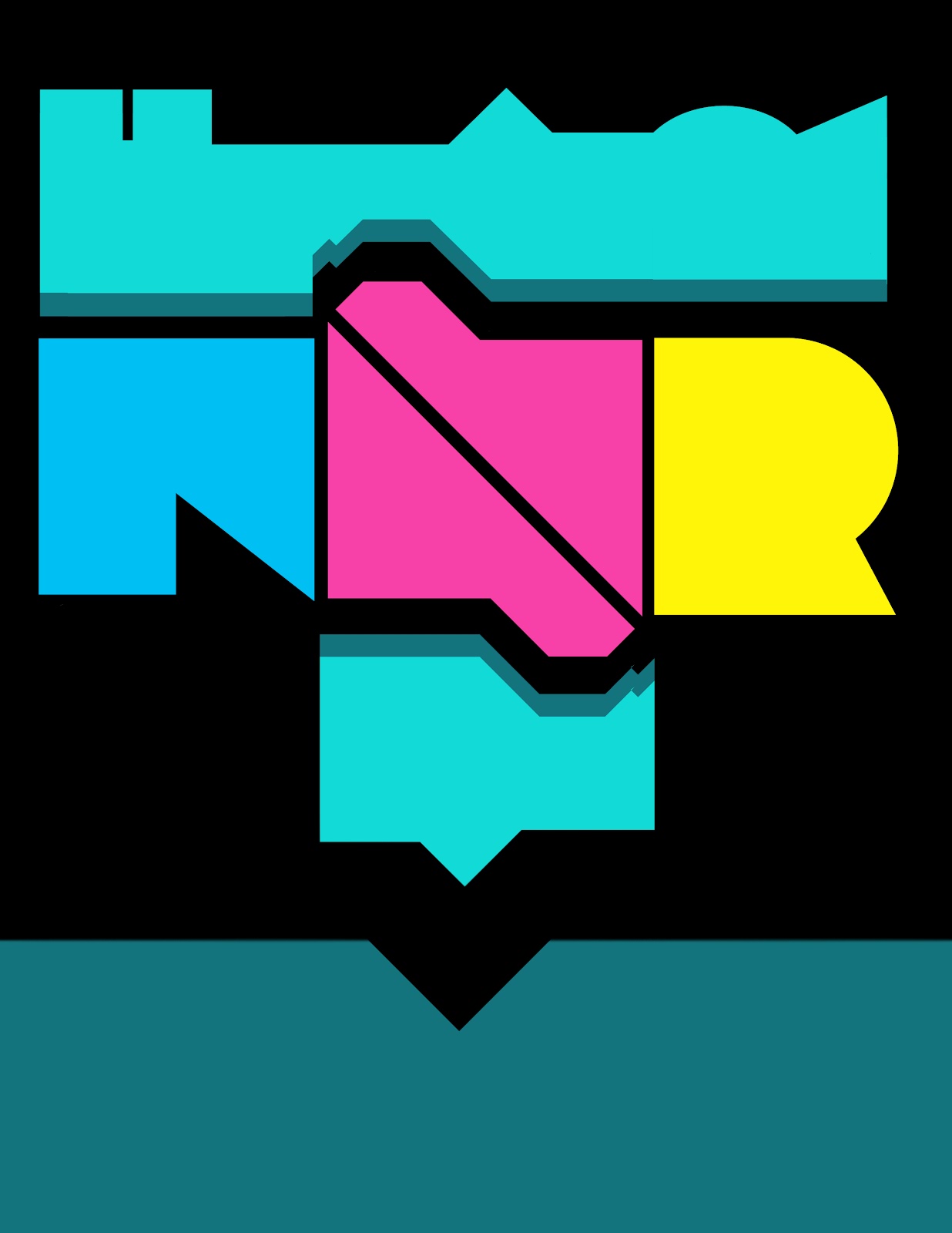
Candy Factory
This is going to be a quick post. I'm going to be updating my abandoned baby blog that i call where is the new stuff. Here is my finished original candy factory poster.
RRRandom series
Hello loyal followers and random robots this is another addition to RRRandom series. This is a side project of my photography class homework. the goal was to take a black and white photo and add color and other elements to it. This is the more abstract version later on i will post the final version. i haven't posted in a while so its good to be back.
RRRandom Series
Since i'm on vacation right now i haven't posted in a long time but enough about that. For my RRRandom series i made this poster while being on a plane towards Dom. Rep. This is just a collection of random words that i heard people say while i was getting on the plane. I recycled my last RRRandom series project and incorporated into this design.
Mirror's Edge Office Artwork
art work found on some of the facilities.
I decided to recreate out of memory the art work found in some of the facilities in the game Mirror's Edge. I did these in less than an hour so there wasn't so much though put into these. maybe later on i will try and create something honoring the game.The rules for creating these are simple: 1. Always use black, gray, white. 2. do not use red 3. Try to be as abstract as possible and 4. Have fun. These were hard to make because i was using Microsoft paint and a track pad so it was a challenge. Mirror's Edge has one of the best art direction i have ever seen in a game so it has a place in my heart no matter what the critics said.
RRRandom series
For my RRRandom series i decided to make an animated gif. This is my first time working with GIFs so i'm really satisfied with the final product. RRRandom series are meant to have no meaning, its all about working with typography, composition and color. I'm definitely looking forward to making more animated GIFs in the future.
CM Bananhammer cover art

So i made an album cover for CM Bananhammer (i don't know if that's a real artist or not these days i can't identify sarcasm) anyways it was for a contest or something. I was thinking of bananas and disapproval when making this album cover. I believe we are all winners. here is the track list:
1. You poked me back
2. Accross the intertubes
3. There's nothing else in life but lulz
4. b&
5. jiggly & wiggly (You make my flag go dumb)
6. Love (I don't know that Pokémon)
7. The ballad of OP
8. pls pls me
9. Plus me tender
10. b& (part 2)
RRRandom series
This is a poster i decided to make because its been a long time since i worked on any project. this poster has no meaning, its just me playing with shapes and type. I will try and keep doing more projects for you guys.
School ends and summer begins (kind of)
I know its been a long time since i last updated this blog but who is keeping track besides me? anyways, the 2012 spring ended and i have work to show you. Below is my final for communication design class. It involves Photoshop and 3 time periods: The 30s, 70s and current 2012. Other than making a pretty poster the objective of this project was to show Form, Meaning, and Function successfully and had to relate well to the content. This summer i will try and be more active on this blog. I will start working on more personal works because my work has gotten too commercial lately.


banners banners and banners
So portfolio reviews is coming soon and every semester we have to present our work using "digication" portfolios. i don't know if "digication is a real word but long story short digication portfolio is not a good place to showcase images. every time i upload images to that site it ends up being color corrected or pixalated. but this is not a place to rant about portfolio websites instead were going to talk about banners for digication portfolio. one good thing about digication portfolios website is that it lets you have a 779 × 200 pixels banner on the top of your page. every semester i change the banner of my portfolio because i get tired of looking at the same thing after a while. one thing that never changes is my mendez logo. this semester i could not make up my mind so i did more than five versions of the portfolio banners. its usually fun when i make these banners for my page but this semester making these banners was a little frustrating since i was never satisfied with the final result. after working hard on these i was able to find a banner that i was happy with.
The next note logo debuts
Hello everyone! long time no see! so my Next Note logo finally made it to the general public. This is the first time my work gets printed on a banner this size. I was very happy with the final results of this project and also it was a honor for me to be part of this project.
Photography by Michael. G
Subscribe to:
Posts (Atom)