Showing posts with label illustration. Show all posts
RRRandom series
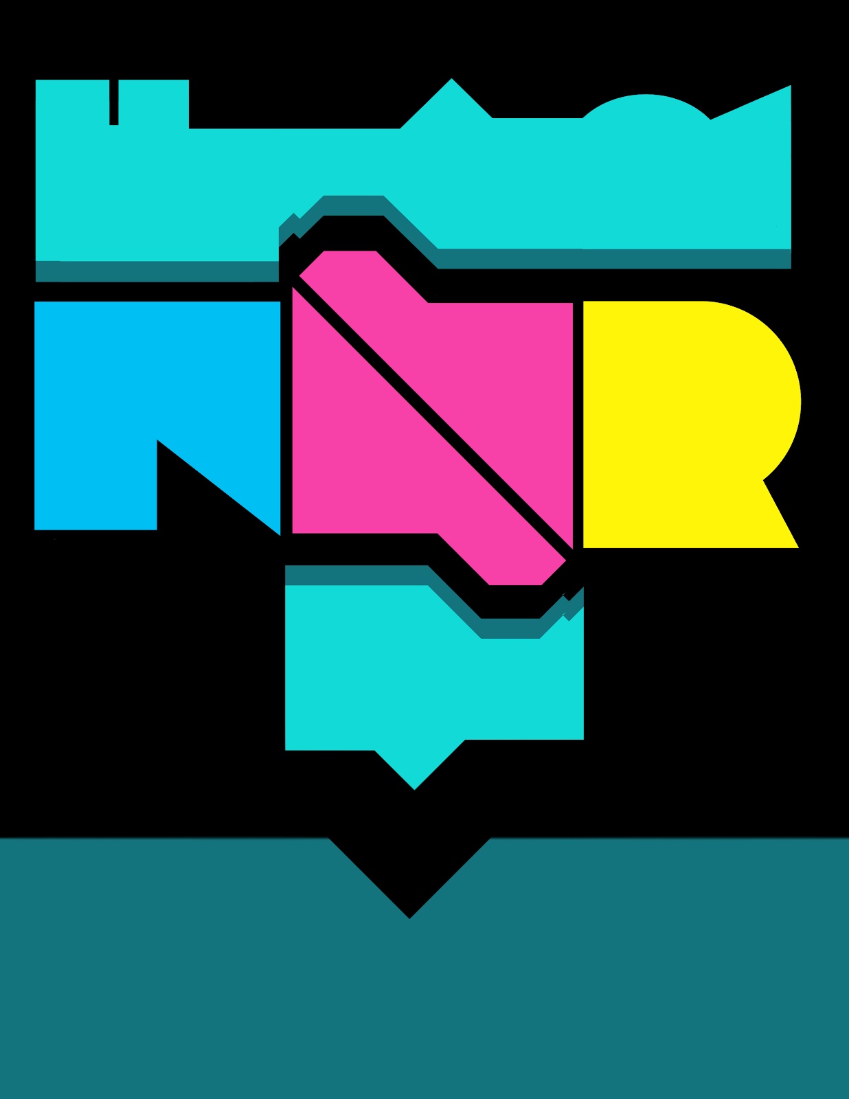
Hello loyal followers and random robots this is another addition to RRRandom series. This is a side project of my photography class homework. the goal was to take a black and white photo and add color and other elements to it. This is the more abstract version later on i will post the final version. i haven't posted in a while so its good to be back.
RRRandom series
For my RRRandom series i decided to make an animated gif. This is my first time working with GIFs so i'm really satisfied with the final product. RRRandom series are meant to have no meaning, its all about working with typography, composition and color. I'm definitely looking forward to making more animated GIFs in the future.
CM Bananhammer cover art

So i made an album cover for CM Bananhammer (i don't know if that's a real artist or not these days i can't identify sarcasm) anyways it was for a contest or something. I was thinking of bananas and disapproval when making this album cover. I believe we are all winners. here is the track list:
1. You poked me back
2. Accross the intertubes
3. There's nothing else in life but lulz
4. b&
5. jiggly & wiggly (You make my flag go dumb)
6. Love (I don't know that Pokémon)
7. The ballad of OP
8. pls pls me
9. Plus me tender
10. b& (part 2)
RRRandom series
This is a poster i decided to make because its been a long time since i worked on any project. this poster has no meaning, its just me playing with shapes and type. I will try and keep doing more projects for you guys.
School ends and summer begins (kind of)
I know its been a long time since i last updated this blog but who is keeping track besides me? anyways, the 2012 spring ended and i have work to show you. Below is my final for communication design class. It involves Photoshop and 3 time periods: The 30s, 70s and current 2012. Other than making a pretty poster the objective of this project was to show Form, Meaning, and Function successfully and had to relate well to the content. This summer i will try and be more active on this blog. I will start working on more personal works because my work has gotten too commercial lately.


banners banners and banners
So portfolio reviews is coming soon and every semester we have to present our work using "digication" portfolios. i don't know if "digication is a real word but long story short digication portfolio is not a good place to showcase images. every time i upload images to that site it ends up being color corrected or pixalated. but this is not a place to rant about portfolio websites instead were going to talk about banners for digication portfolio. one good thing about digication portfolios website is that it lets you have a 779 × 200 pixels banner on the top of your page. every semester i change the banner of my portfolio because i get tired of looking at the same thing after a while. one thing that never changes is my mendez logo. this semester i could not make up my mind so i did more than five versions of the portfolio banners. its usually fun when i make these banners for my page but this semester making these banners was a little frustrating since i was never satisfied with the final result. after working hard on these i was able to find a banner that i was happy with.
The next note logo debuts
Hello everyone! long time no see! so my Next Note logo finally made it to the general public. This is the first time my work gets printed on a banner this size. I was very happy with the final results of this project and also it was a honor for me to be part of this project.
Photography by Michael. G
This website just turned into my own sub domain
i finally transferred this blog to my domain. at first i wanted tobuy a seperate google domain for this blog but then i decided to make the blog part of my own website. right now I'm taking intro to webdesign and we had to buy our domains. i'm really exited to start building my website. right now I'm learning the basic stuff about web hosting so its going to be a while before i have my website ready to go. featured image is the tittle for the book i designed for typography class.
WPA era poster
Here is my take on WPA era posters. it was a challenge trying to mimic the way they used to do posters in that era but i still had a lot of fun making this poster.
The next note: improvements have been made
learning hangul
As some of you know i am learning Korean. i find the Korean language and Hangul to be beautiful so i'm working hard until i become trilingual. i made this poster using my little Hangul skills and i mixed it up using a type that looks like Hangul. in Hangul i wrote an expression that is used to encourage others or yourself (sounds similar to the word fighting). i did this poster in order to keep myself motivated in my language learning journey.
Are you having trouble changing your ringtone?
And now for Illustrated tutorials! i was really happy with the outcome of this project. i took my htc evo phone as a model and illustrated the entire phone from scratch. we had to explain how to program your phone with 10 steps without using words. although the project was a little challenging for me, it was still fun.
Animal Farm
Book cover for George Orwell's "Animal Farm". This is my take on the minimalist style, i got inspired after seeing a bunch of minimalist movie posters. i try to mimic the way the took key elements from the movie and try to illustrate that in the simplest way possible as well as the use of texture in the poster.
Fancy Panda!
This is my take on post-stamp design. the professor told us to make a drawing that shows "value". since i was distracted when he gave us the assignment (busy worrying about my English test ), i made a flat illustration of a panda. one of my classmates saw what i was doing and then he told me that it had to be an illustration that showed shading or "value" in a sense. so i did i a hand drawing and scan it using illustrator. i did not wanted to waste my firs drawing so i decided to make that into an logo. behold: fancy panda!
Magazine Layout
This is my first magazine layout. i made it based on an article i found on the huffingtong post. i started by creating the illustration for the article and then i type set the rest with help of my type professor (I'm still learning ) sorry guys for being so robotic lately, I'm gonna try to write with my business caps off from now on.
Subscribe to:
Posts (Atom)